Custom website design starts where templates end, with your goals, your target audience, and your brand identity at the core.
Instead of squeezing your business into a generic layout, a custom website designer builds every element from scratch to support your growth. It's a completely custom fit web design not a one-size-fits-all solution.
Let's Discuss your projectHere's what you get with professional custom design services:
We craft every website based on your business objectives, customer behavior, and brand positioning to deliver a solution that drives measurable growth and long-term success.
Our responsive designs combine modern aesthetics with the latest design trends, ensuring your website looks professional, distinctive, and competitive in today's digital landscape.
We build websites with smooth navigation, clean layouts, and mobile-first interactions that enhance usability, improve engagement, and encourage visitors to take action.
Your website undergoes continuous testing and optimization across devices and browsers to maintain fast loading speeds, strong security, and search-engine-friendly performance.
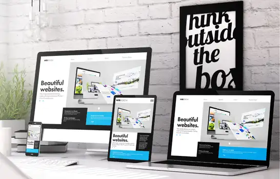
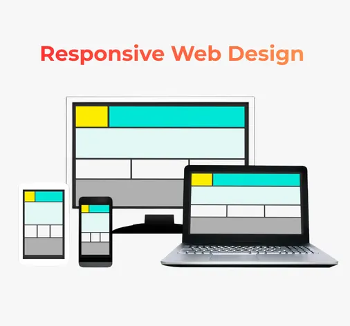
Everything your website needs to work smoothly on mobile, tablet, and desktop devices.

Mobile, Tablet & Desktop Friendly Layout
Clean and Modern Page Design
Easy and Clear Website Navigation
Fast Loading Pages Across All Devices
Optimized Images and Clean Code Structure
Readable Content with Proper Spacing
SEO-Friendly Page Structure
No Separate Mobile or Desktop Versions
Tested on All Popular Screen Sizes
Easy to Update and Maintain in the Future
Compatible with New Devices and Screen Sizes
Better User Experience Across All Platforms
Having a website that works seamlessly on all devices is essential for any business, whether small, medium, or large. Professional responsive web design ensures your website adapts automatically to different screen sizes, from desktops to smartphones and tablets. This not only improves user experience but also boosts your online visibility, as search engines like Google prioritize mobile-friendly websites in their rankings.
Responsive web design goes beyond just adjusting layouts; it enhances website performance and loading speed. Optimized images, clean code, and flexible design elements make your website faster, reducing bounce rates and keeping visitors engaged longer. A well-performing website signals credibility to both users and search engines, which can positively impact your search rankings and drive more organic traffic to your business.
Another key advantage of responsive web design is its simplicity in SEO management. By using a single URL for all devices, search engines can crawl, index, and understand your website more efficiently. This prevents duplicate content issues and ensures your valuable content reaches the right audience. Whether you run a local store, an e-commerce platform, or a corporate enterprise, a responsive website lays the foundation for sustainable online growth.
Investing in professional responsive web design not only improves user experience but also strengthens your brand's presence across the web. Businesses of all sizes can benefit from increased accessibility, faster performance, and improved search engine visibility. By combining functionality, aesthetics, and SEO best practices, your website becomes a powerful tool for attracting new customers and growing your business online.
Choosing the right agency for your responsive website can make or break your online success. The first thing to consider is their portfolio and experience. A professional agency should have a proven track record of creating responsive websites for businesses of all sizes. Reviewing their past projects helps you understand their design style, creativity, and ability to deliver mobile-friendly solutions.
Next, check their technical expertise and SEO knowledge. A skilled agency ensures your website is not only visually appealing but also optimized for speed, performance, and search engines. Ask about their approach to mobile-first design, page loading times, clean coding practices, and secure website development.
It's also essential to consider client reviews and support services. Positive testimonials reflect reliability, professionalism, and the agency's commitment to delivering projects on time. Additionally, post-launch support and maintenance options ensure your website remains up-to-date and fully functional.
Finally, evaluate their customization and strategy. A good agency tailors websites to match your brand identity, business goals, and target audience. They should provide flexible solutions that combine responsive design, user experience, and SEO best practices. By focusing on these key factors, you can select a web design agency that creates a responsive website that truly drives business growth.
Web Bird offers expert responsive website design and development to ensure your site looks great and functions flawlessly across mobiles, tablets, laptops, and desktops. Our in-house design team, flexible development process, SEO-ready structure, and performance-focused solutions guarantee faster load times, better user experience, and higher search engine rankings.
Responsive web design plays a key role in improving SEO by ensuring your website works properly on all devices, especially mobile phones. With Google's mobile-first indexing, the mobile version of your website is the primary factor used to decide search rankings. If your site is not mobile-friendly, it can negatively affect visibility on Google. A responsive website adapts automatically to different screen sizes, providing a smooth browsing experience that meets search engine guidelines.
Another major SEO benefit of responsive web design is improved website performance. Responsive sites are built with optimized layouts and clean code, which helps pages load faster across devices. Faster loading speed improves user experience and reduces bounce rates, both of which are important ranking factors for Google. When visitors stay longer and interact more with your site, search engines see your website as useful and relevant, leading to better rankings.
Responsive web design also simplifies SEO management by using a single website and URL for all devices. This makes it easier for search engines to crawl, index, and understand your content without confusion. It also prevents issues like duplicate content that can harm SEO. By combining mobile usability, fast performance, and a clear site structure, responsive web design helps businesses attract more organic traffic, improve search rankings, and grow their online presence.
When responsive web design is combined with SEO best practices, your website doesn't just look good—it performs better in search results. A responsive website improves
usability, speed, and structure, helping search engines understand and rank your site more effectively.
Responsive websites are built with optimized images and clean code, which helps pages load faster on all devices. Faster loading improves user experience and supports Google's Core Web Vitals, which directly impact search rankings.
When a website works smoothly on mobile devices, visitors stay longer and explore more pages. This reduces bounce rates and sends positive engagement signals to search engines.
With a single responsive website, search engines can crawl and index your content more efficiently. This ensures all important pages are discovered and ranked properly without technical issues.
Responsive design uses one URL for all devices, removing the risk of duplicate content. This avoids SEO penalties and eliminates the need to manage separate mobile and desktop versions.
Improved navigation, clear layouts, and mobile-friendly design increase user interaction and time spent on the site. These behavior signals help improve your website's overall ranking potential.
By combining mobile usability, fast performance, and clean structure, responsive web design helps your website gain better visibility in Google search results and attract more organic traffic.
Find answers to common questions about our website design, development, SEO, and digital marketing services.
As Mumbai's leading responsive web design specialists, we create websites that adapt perfectly to all devices—mobile, tablet, and desktop. Our mobile-first approach ensures optimal user experience, faster loading times, and higher conversion rates for Mumbai-based businesses.
We design for mobile devices first, then scale up to larger screens. This ensures perfect performance on smartphones where most Mumbai users browse. Our designs feature thumb-friendly navigation, optimized images for slower connections, and fast loading speeds critical for Mumbai's mobile-heavy audience.
We implement Mumbai-specific SEO strategies including local keywords, Google Business Profile optimization, location pages for different Mumbai areas (South Mumbai, Western Suburbs, etc.), and content tailored for Mumbai audiences. Our technical SEO ensures fast loading on local networks.
We integrate clear call-to-action buttons, strategic contact forms, WhatsApp integration for Mumbai users, quick enquiry options, trust signals (reviews/testimonials from Mumbai clients), and fast-loading pages—all optimized to convert visitors into customers.
Yes! We specialize in creating affordable, high-converting websites for Mumbai's small businesses, startups, restaurants, local shops, service providers, and professionals. Our solutions are tailored to Mumbai's competitive market and budget requirements.
Our websites typically load under 2 seconds on Mumbai networks. We optimize images, minify code, leverage browser caching, and use Content Delivery Networks (CDNs) to ensure fast performance for Mumbai users across all devices.
Absolutely. We offer monthly maintenance plans including updates, security checks, content changes, and performance monitoring. We also provide local Mumbai support with quick response times for any issues or updates needed.
Yes! We have a portfolio showcasing responsive websites we've created for various Mumbai businesses across industries. Contact us to see case studies and live examples of mobile-optimized, high-converting websites working successfully in Mumbai.
We build high-performance responsive websites that look stunning and work flawlessly across all devices — smartphones, tablets, laptops, and desktops.
Our focus is on user experience, speed, security, and measurable business growth.


 We work with clients for years, not just one project Direct communication with designers and developersNo shortcuts or ready-made templates Clear timelines and honest communicationMost work comes from repeat clientsSupport even after the website goes liveWork is checked manually before delivery, not rushed